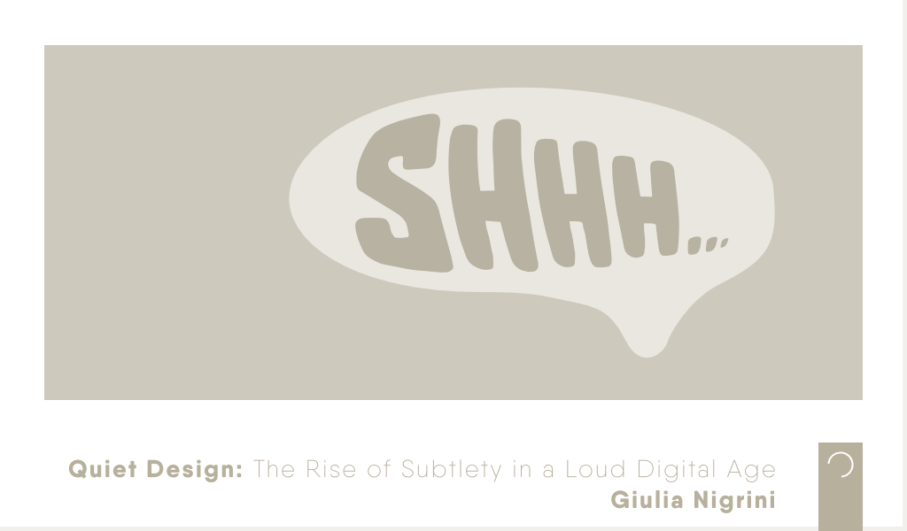
Quiet Design: The Rise of Subtlety in a Loud Digital Age
Somewhere between a neon MTV bumper and a dancing Windows 95 screensaver, design learned how to shout. The noise took centre stage as we found ourselves being drawn in by the boldness and bright colours, the buzz of notification pings, and doomscrolling our time away. But lately, a quiet rebellion has been forming. Designers are turning down the volume, dusting off their palettes, and rediscovering the beauty of subtlety. Through quiet design.
From Synth Pop to Slow Mode
The 1980s gave us chrome gradients, drop shadows, and the cult of “more is more.” The 1990s brought grunge typography and chaotic collage; glorious, messy, loud. But in today’s overstimulated world, that maximalist nostalgia now feels like an energy drink hangover. The new mood? Think Walkman on low volume. Think the space between two beats on a Talking Heads track. You’re Tracy Chapman in a fast car. Going back to simplicity and focusing on giving homage to specific elements, instead of everything everywhere all at once.
Whitespace Is the New Chrome
Quiet design isn’t sterile minimalism. It has an attitude, just whispered gently into your ear. It swaps gloss for grain, gradients for texture, Helvetica Bold for something with breath. There’s rhythm in restraint. It’s the Bauhaus after a yoga retreat. Even digital interfaces are picking up the vibe: fewer bouncy animations, more gentle fades. The scrollbar no longer screams; it glides.
It’s as if the web collectively decided to step out of the rave and into an art book printed in 1993. Which I am grateful for. The overwhelming brightness and sheer “school project” vibes were nerve-racking on a good day. I think many of us experienced it the same way. Over time, you become immune to its attraction, and you begin to phase out the noise. Working around it. Ultimately, you do not engage with the brand. Defeating the purpose of branding.
Silence Is the New Strategy
In the branding world, silence can be louder than sound. Think of Aesop’s muted tones, Muji’s quiet confidence, or Apple’s mid-2000s “Think Different” whisper. Subtlety signals trust. The brand that doesn’t shout assumes you’re already listening.
What’s fascinating is how this movement borrows from the past but strips away the chaos. The soft gradients of ‘80s airbrush art return, but without irony. Serif type reappears, not as retro, but as human. The analogue hum of VHS fuzz becomes an aesthetic of calm imperfection.
It’s nostalgic with noise-cancelling headphones.
The Future Will Be Gentle
The next design revolution might not arrive with fanfare. It might slip quietly onto your feed, a clean layout, a muted colour, a feeling of relief. Quiet design doesn’t fight for your attention; it earns your trust. In a culture that’s always shouting, the most radical move might just be to whisper.